

Make Tier 3 Obvious At First Contact.
The homepage became a revenue router.
The problem
Clinic owners arrived at a homepage that led with Continuing Education. The primary navigation, hero CTAs, and page structure all assumed the visitor was a physical therapist looking to learn , not a business owner evaluating practice management software. Tier 3 buyers had to hunt for the right path, and most didn't bother.
What I did
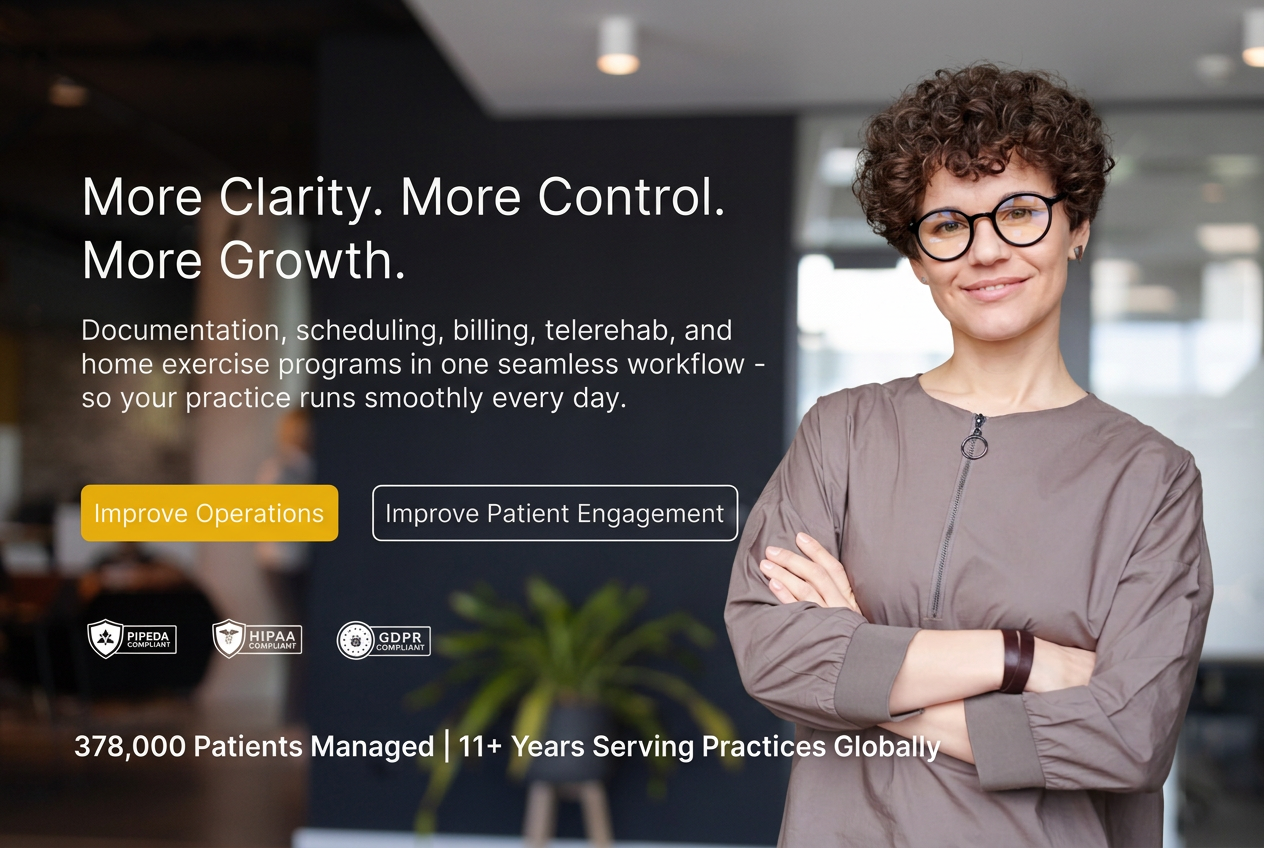
I introduced a clear "I run a clinic" entry point on the homepage that visibly outranked education paths. This wasn't a minor navigation tweak, it was a fundamental shift in how the homepage acknowledged different visitor intents.
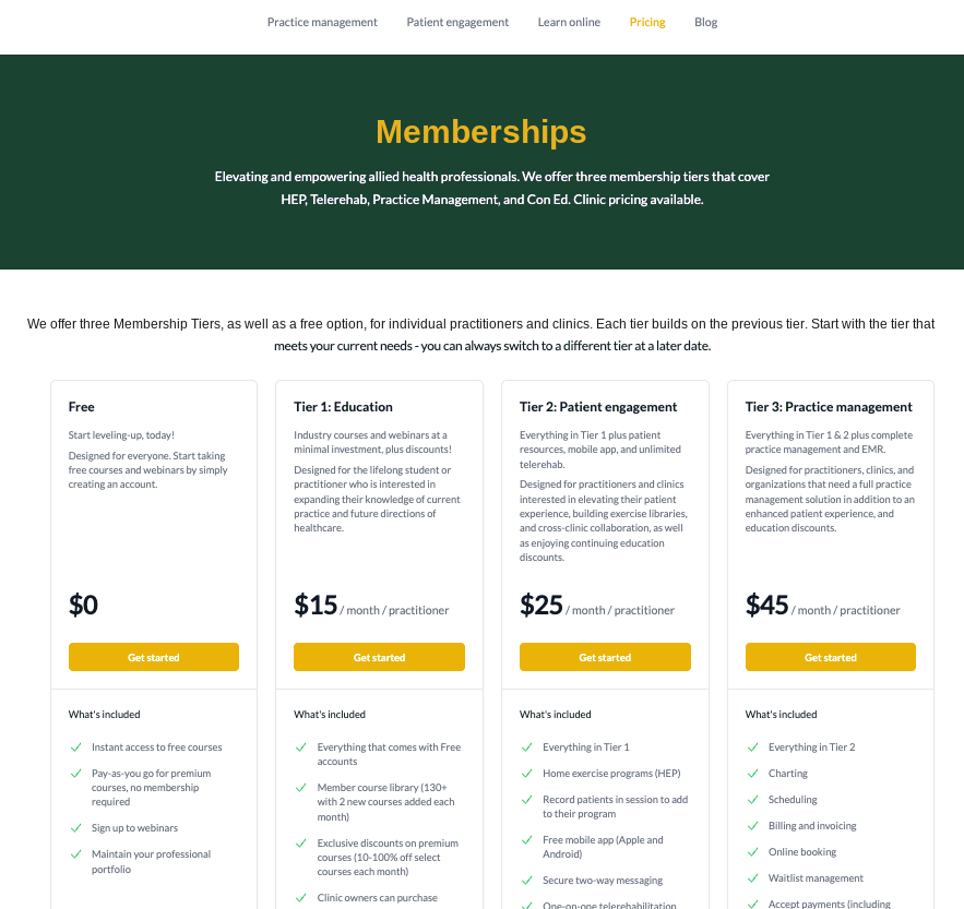
I also created a secondary Patient Engagement page to separate HEP/Telerehab (a lower-ARPU product often bundled with education) from the core Practice Management path. This gave each product its own conversion surface and prevented Patient Engagement from diluting the Tier 3 demo motion.
The homepage now routes clinic owners directly into a demo-first evaluation experience with US-relevant language (cash-based practices, multi-location operations, operational efficiency) so buyers recognize fit instantly.
The result
Tier 3 buyers no longer had to decode an education-first homepage. The path from "I run a clinic" to "Book a demo" became direct, visible, and frictionless.