Screen #1
Unified Homepage
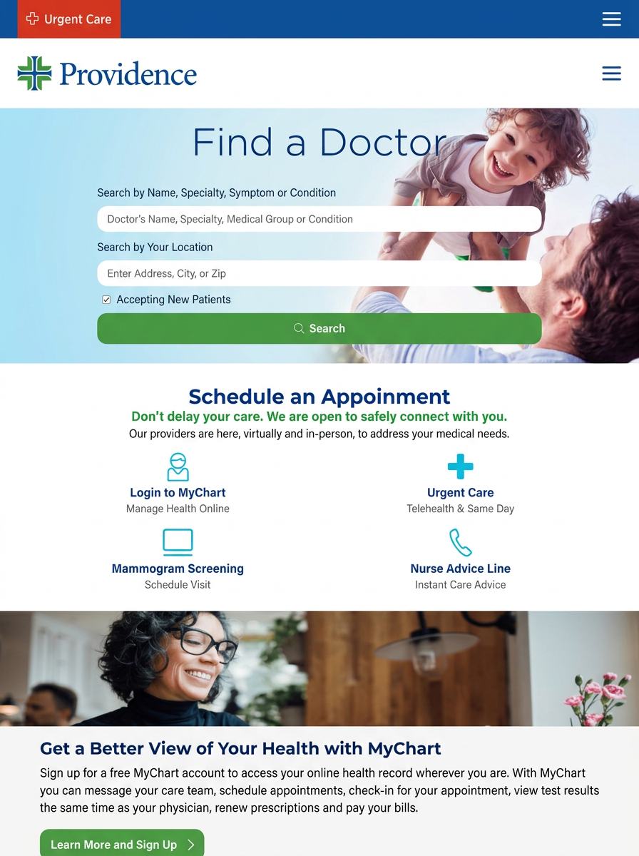
Triage screen, five front-door actions
Blocker addressed
"I don't know where to start."
$500K Website Rebuild · Case Study
Providence Health, California Medical Groups
Web Strategy · IA · Capability Build · Launch
I led a $500K website rebuild that consolidated 19 California medical-group sites into one patient-first digital front door, scoping and shipping MyChart access, a 24-hour nurse advice line, online scheduling, virtual visits, and self-serve bill pay alongside the redesign, not after it.


The Approach
We rebuilt the experience around what patients actually came to do, and only kept what served those journeys.
What does a patient actually come here to do?
We rebuilt the IA around the five things patients actually arrived for: find a doctor, find a location, schedule a screening, log into MyChart, and pay a bill. Every other piece of content was demoted, consolidated, or cut. The homepage stopped being a brochure and became a triage screen.
What does each facility actually need this site to do?
We ran working sessions with subject-matter experts at every one of the 19 facilities, plus C-suite leadership and a healthcare-specialized vendor. Every regional service line, intake workflow, and compliance constraint got mapped, so the unified site never lost what made each facility's local patient experience work.
What does the patient need that doesn't exist yet?
Three brand-new patient-facing systems were built into the launch: MyChart login for patient records, a 24-hour nurse advice line with virtual visit handoff, and an online bill-pay flow. The redesign wasn't cosmetic, it added the digital front door the system had never had.
Patient Experience
Every front-door action got measurably faster, simpler, or possible for the first time.
Before
19
After
1
Before
Buried
After
Front door
Before
Multi-step
After
MyChart
Before
None
After
24/7 line
The 5 phases
Each phase built on the last, discovery fed journey mapping, journey mapping fed IA, IA fed the new capability builds, and the cutover preserved every facility's local trust.
Stakeholder Discovery
Talk to every facility before touching a wireframe.
Phase 1 was relationship work. We ran structured interviews with SMEs from all 19 facilities, plus C-suite leadership and the outside healthcare-web vendor. The deliverable wasn't a deck, it was a single source of truth for service lines, regional differences, and the non-negotiables each facility needed preserved.
Blocker addressed
"Every facility thinks their site is the most important."
Patient-Journey Mapping
What does a patient actually need?
Phase 2 took the discovery data and rebuilt it around the patient. We mapped the real reasons people visit a health-system site, find a doctor, find a clinic, schedule a mammogram, get advice without coming in, pay a bill, log into records, and ranked every existing piece of content against those journeys.
Blocker addressed
"Patients can't find what they came for."
IA + Prototype
Consolidate 19 into 1 without losing 19.
Phase 3 was the hard architecture work. A unified information architecture, a regional-routing system that preserved each facility's local context, and a Figma prototype validated against SMEs and patient testers. Find a Doctor, Locations, and Login to MyChart became the three load-bearing front-door actions.
Blocker addressed
"Consolidation usually means everyone loses something."
New Capability Builds
Build what didn't exist yet.
Phase 4 added the systems patients had been asking for: a MyChart login surface for records and messaging, a brand-new 24-hour nurse advice line with virtual visit routing, online appointment scheduling for mammograms and primary care, and a self-serve bill-pay flow. Each was scoped and shipped alongside the redesign, not after it.
Blocker addressed
"We can't ship a redesign without the tools patients actually need."
Migration + Launch
Cutover without breaking trust.
Phase 5 collapsed 19 production sites into one without breaking inbound search, bookmarked records, or care continuity. Redirect mapping, regional URL structure, and a phased cutover by region kept SEO equity intact and gave each facility a soft landing into the unified experience.
Blocker addressed
"Patients can't lose access mid-care."
The Experience
Three load-bearing surfaces from the unified site, each tuned to a specific patient journey, with the new self-serve capabilities built in.
Screen #1
Unified Homepage
Triage screen, five front-door actions
Blocker addressed
"I don't know where to start."
Screen #2
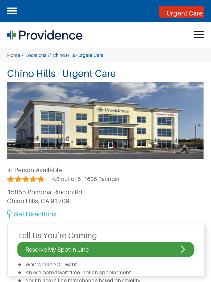
Urgent Care
Reserve a spot · same-day care
Blocker addressed
"I need care now and don't want to wait in an ER."
Screen #3
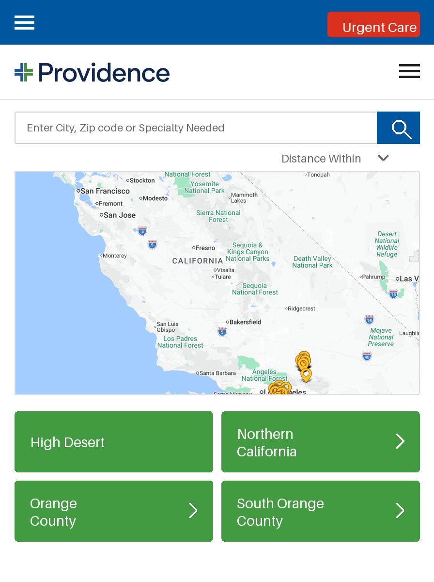
Find A Location
Region-routed location finder
Blocker addressed
"I don't know which facility serves my area."
Why this approach
It treated 19 facilities as one patient, not 19 brands. Patients don't think in facility names. They think "I need a mammogram near me." The unified IA started from that sentence and worked backward.
It shipped capability, not just design. The redesign would have failed if MyChart, the nurse advice line, online scheduling, virtual visits, and bill pay weren't there at launch. We scoped them in from day one, not as phase two.
It preserved every facility's local trust. C-suite buy-in and SME interviews at every site meant the cutover landed without a single facility feeling overwritten. Regional routing kept local context intact inside a unified frame.
This is the kind of UX consolidation work I do. If you're sitting on a fragmented digital footprint, let's talk.